Swatch cards and winter color palettes
Acrylic paint is often my weapon of choice as I love the versatility. Even with only a few colors, you can mix, layer, and create texture. But I’ve been trying to incorporate different materials in my work, especially to bridge the gap between what I make at the studio versus what I’d sketch on location, travels, or during Zoom sessions.
Pencils or gouache paints that have been catching dust are finally getting the attention they deserve, and I’ve been discovering more fantastic materials like Artgraf, Nitram charcoal, and markers.
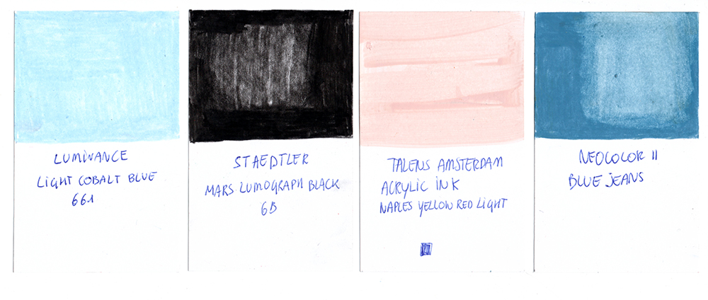
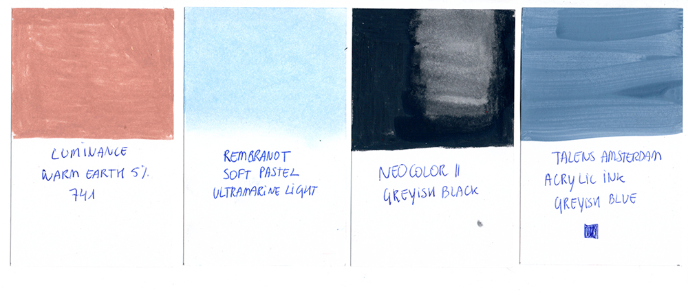
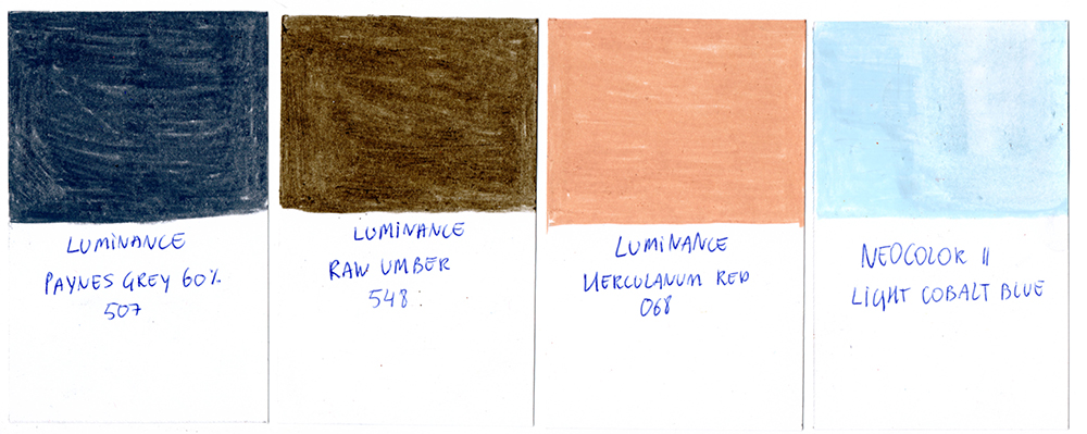
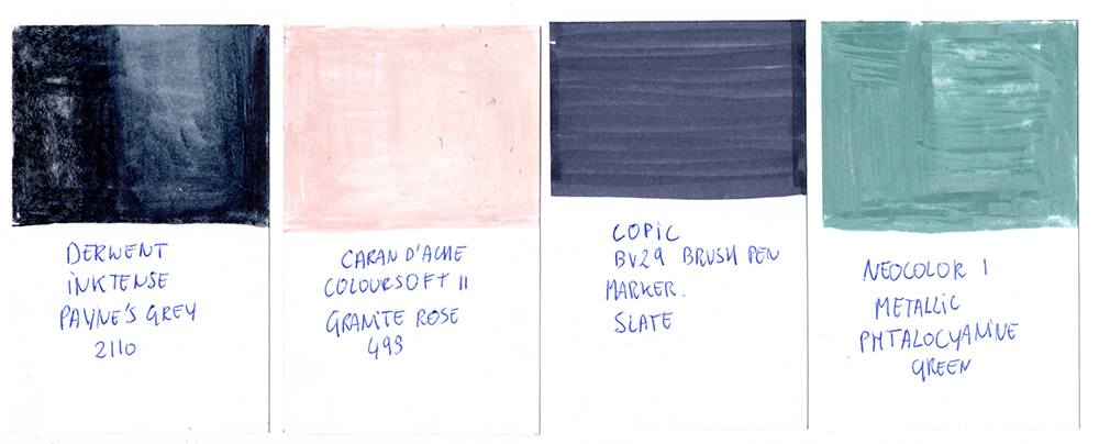
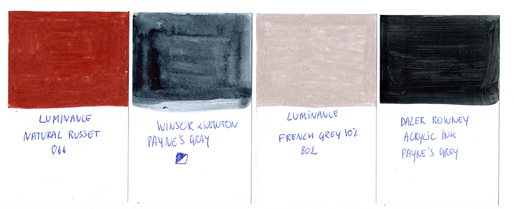
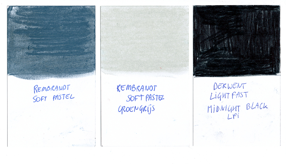
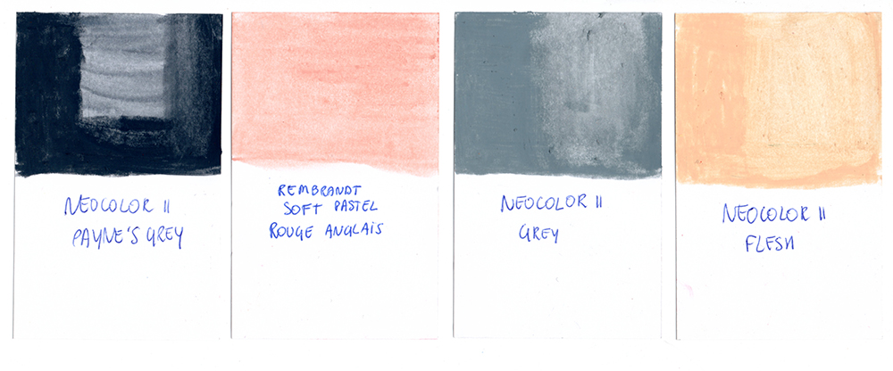
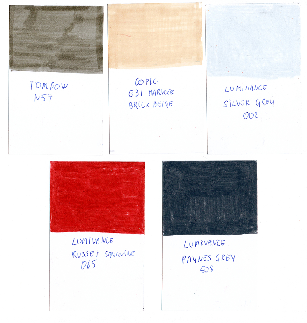
Inspired by TJ Marston who created a color wheel with all her materials, I started swatching (almost) every color that I own (except for the acrylics and oils pastels for now) on Bristol cards. Pencils, pastels, neocolors, markers,… they all got their card with the name of the brand, color code, and sometimes extra information.
What I will use them for:
– creating color palettes when I want to work with limited colors.
– testing (new) color combinations.
– having an overview of the colors that I have, and which I might need to add.
– selecting colors before heading out so I could take less :-).
– reducing options while working.
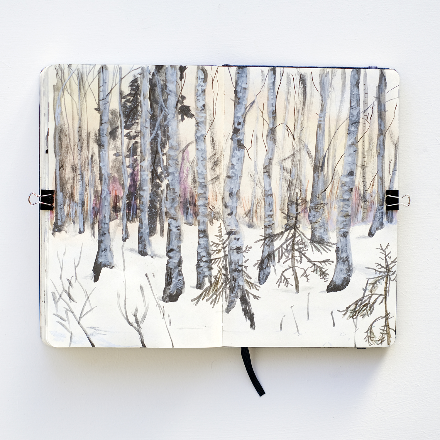
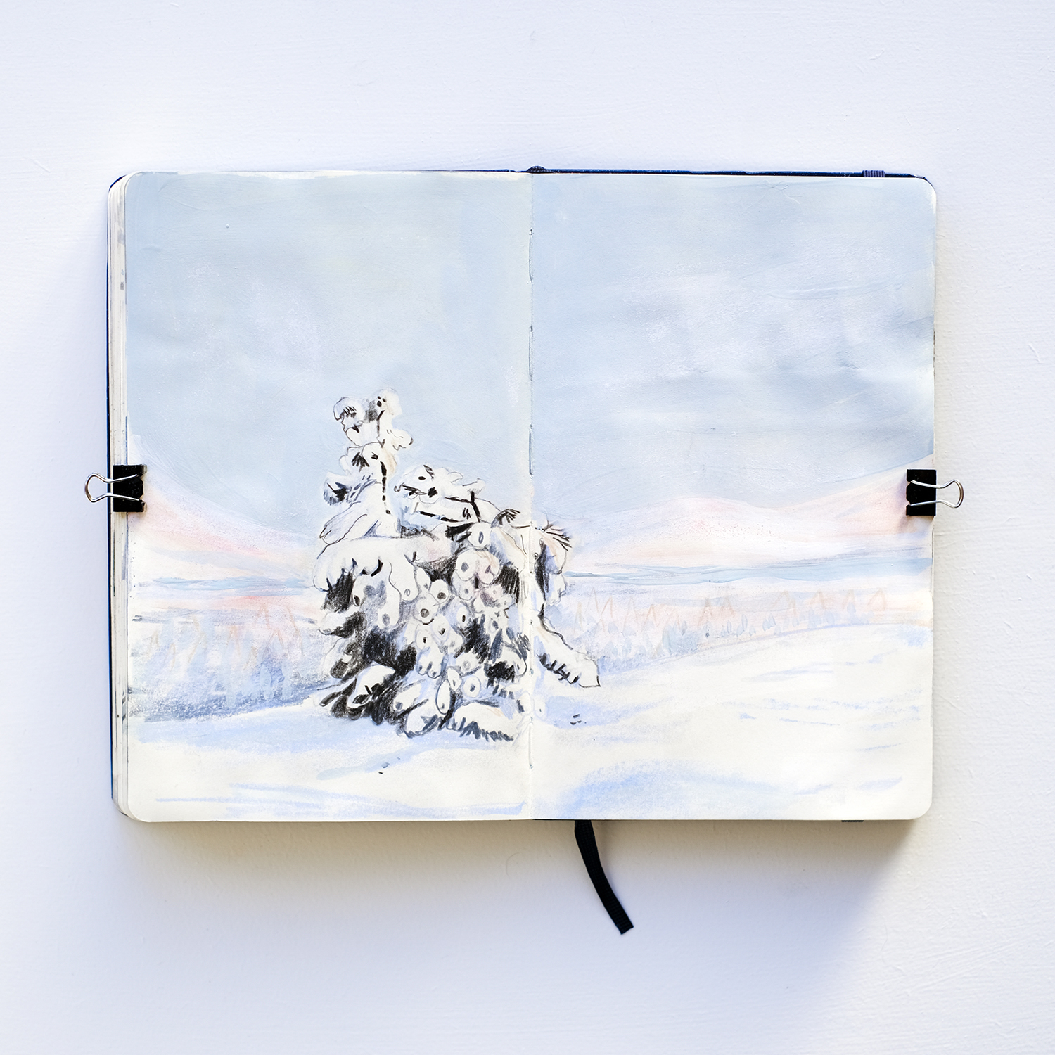
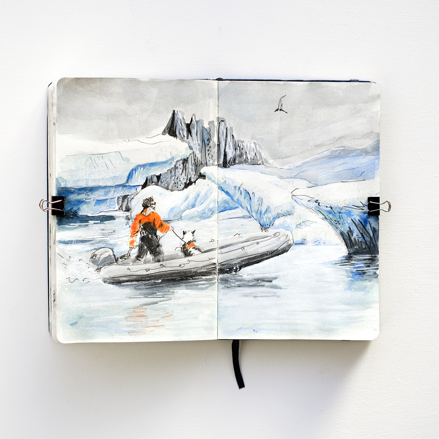
This January, my focus is winter landscapes. I’m working with photographs that I took in Sweden, Iceland, and Lapland, and specifically pay attention to selecting colors.
Random things I noticed:
– I don’t have much purple/pastel tints. On their own, I’m just not into pastels or purple. (with acrylics I would just mix them if I need them). When I bought some printmaking paper earlier, I grabbed a pastel purple Stabilo marker at the last minute before closing time.
– I would not mix soft colors with black, and even in the color palettes I often use Payne’s grey. But to get that typical winter mood, the strong contrast between a very dark color and pastels is something I can learn to appreciate. Normally I only use pure black for printmaking or when I’m not using any other colors.
– Blue is my favorite color, and I have bluish-grey and cobalt blue in almost every medium.
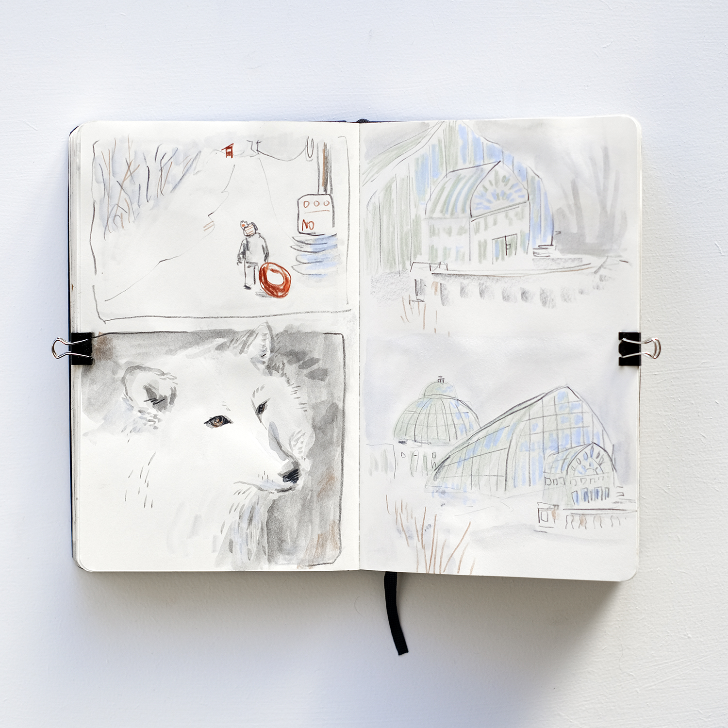
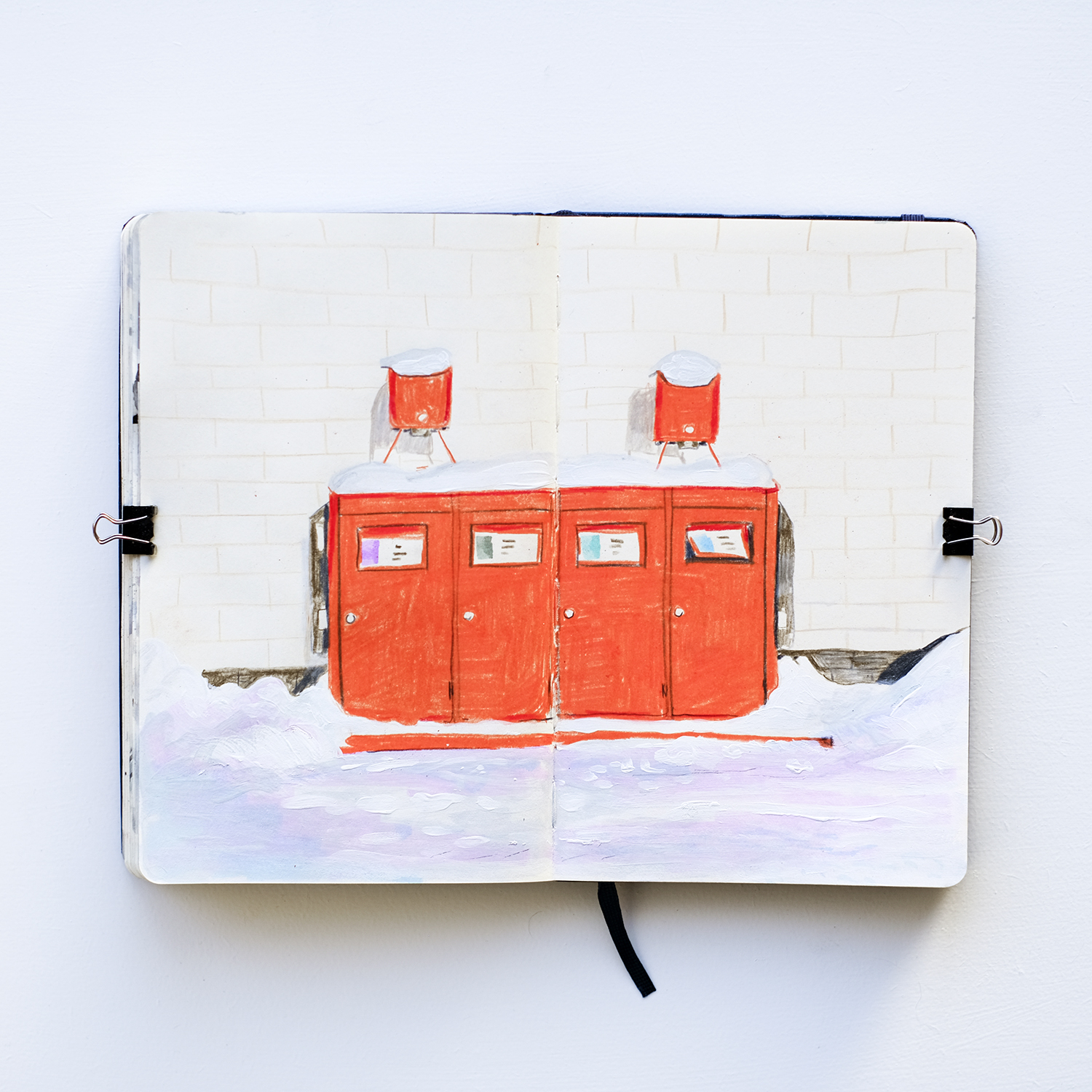
Here I used some of the pastel purple Stabilo marker. It was a bit too bright for this image, but toned down with gouache, I think it’s perfect.