Linocut printmaking & color test
This lino is an exercise to challenge an important crux.
The project/zine I am currently working on will be partly screen-printed, a technique that I wanted to learn and use for a long time. But there is one big thing that I need to learn fast now: thinking and drawing in separated layers.
When painting I mostly use acrylic, starting just from a white piece of paper, choosing some colours, sometimes putting on some music and I start. Often not with a clear plan, only with a feeling or thought that will be translated. Within the layers of paint the image reveals itself.
When designing an image for screen-print, you need a different image for every layer of colour. So while with paint you can just add a little touch of yellow in the end, with printing you need that already in your design or it will not be happening.
Also, some layers are transparent, some are opaque, …
Somewhere I got lost, not seeing clear how to built the image with different layers and different colours.
It was Gerard Leysen from Afreux who created a breakthrough for me by showing me some designs he made for riso printing. He draws and paints on a thick kind of chalk paper, which allows you to see all layers while working.
This way I can still make free associations while painting, but work towards a clear design for print.
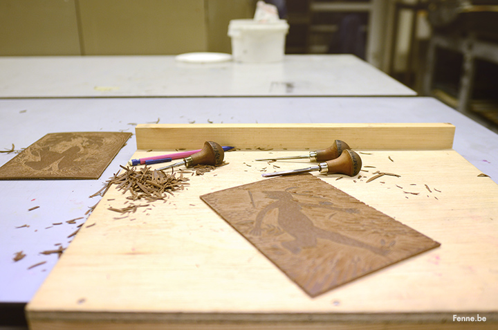
 Lino felt like something in between. You need a drawing/plan and cut away all the part that don’t need any ink but there is still some space for the unexpected.
Next step: layers and layers for my next short story.